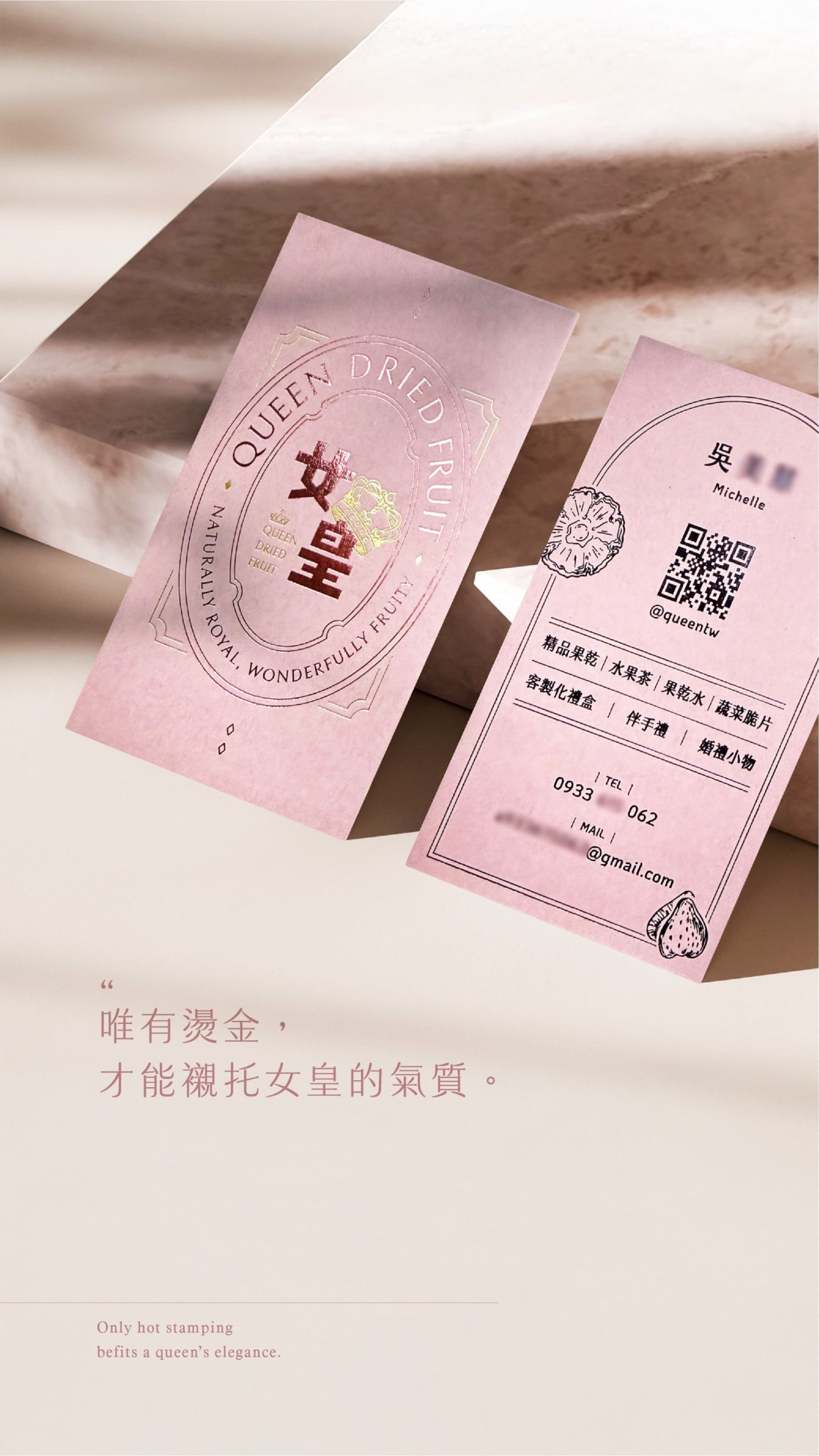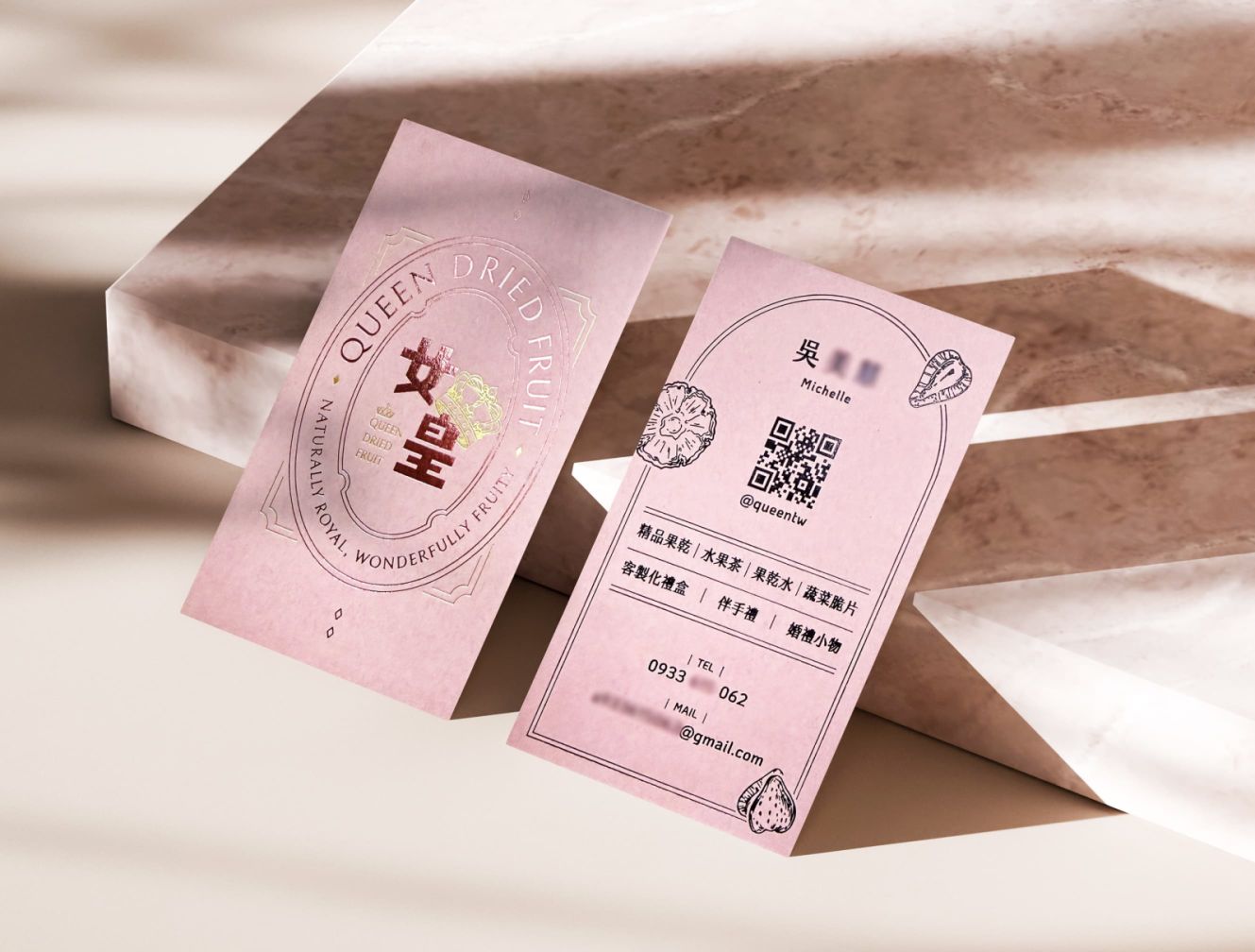
Queen Dried Fruit’s business card design uses a soft pink tone as its main visual foundation, reflecting the brand’s sweet, delicate, and refined product image.The overall layout combines classical decorative framing with curved compositions and brand typography, conveying an elegant, sophisticated, and memorable identity that echoes the name “Queen.”Printed on 300 gsm British New Age paper, the card features a delicate and smooth surface that adds warmth and tactile depth.
The front side is finished with matte gold foil and pink foil stamping to highlight the title and ornamental details, creating a subtle yet luxurious visual effect under the light.The back side uses black foil stamping for the information layout, enhancing both readability and overall refinement.
Through the careful combination of color, material, and foil-stamping craftsmanship, the business card becomes more than a contact tool—it serves as an extension of the brand impression itself.