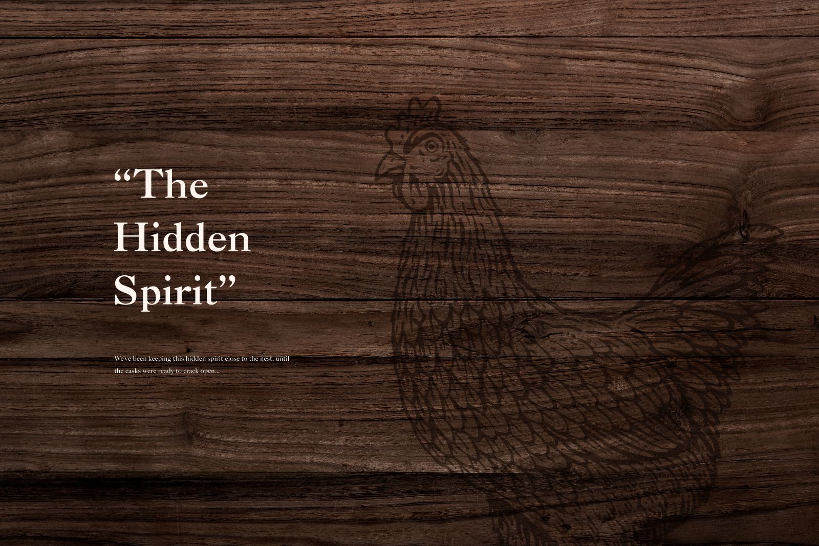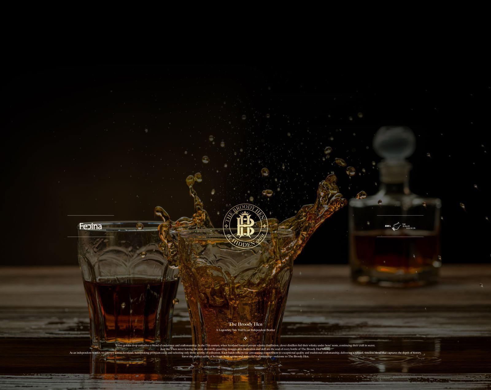
拾酒人蛇年威士忌禮盒
THE BROODY HEN WHISKEY PACKAGING DESIGN
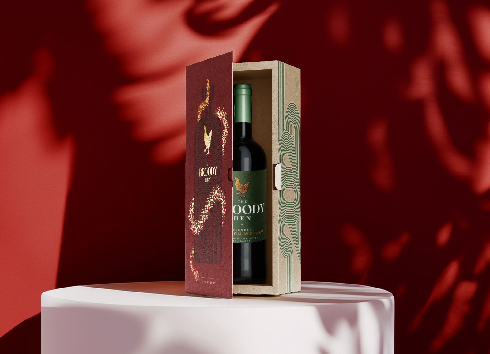
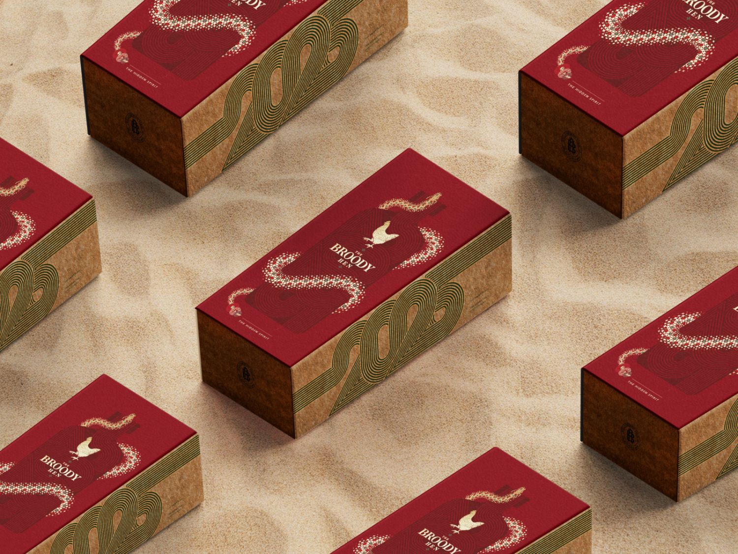
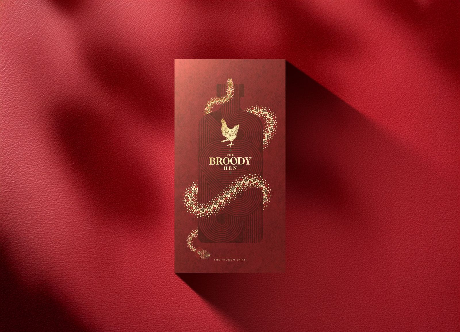
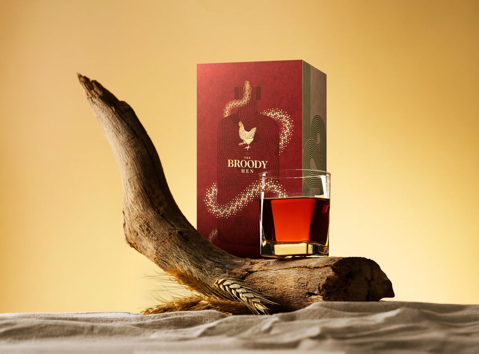
此款蛇年限定威士忌禮盒靈感汲取自農曆生肖「蛇」,將象徵智慧、蛻變與神秘力量的意象,透過流動的線條轉化為瓶身視覺語彙。仔細觀察,瓶身輪廓中的線條紋路為年份「2025」的連續線段,寓意時間的流動與酒體的歲月沉釀,在設計中巧妙與生肖主題融合,為包裝注入探索樂趣與文化深度。 包裝外盒以東方紅為基底,象徵節慶與熱情,搭配局部燙金工藝勾勒蛇形軌跡,營造出如蛇鱗般靈動的視覺層次;而側邊與瓶身標籤融入品牌標誌性色彩—森林綠作為點綴,平衡整體視覺的沉穩與現代感,體現「The Broody Hen」品牌低調中見不凡的精神。 整體設計以文化、質感與現代設計語言交織,傳遞一份寓意深遠、極具收藏價值的節慶獻禮。
Inspired by the Chinese zodiac sign of the Snake, this limited edition whisky gift set channels the symbolism of wisdom, transformation, and mystique. Flowing lines evoke the serpentine form and are artfully translated into the bottle’s visual language. Upon closer inspection, these lines subtly trace the numerals “2025,” representing the passage of time and the patient maturation of the spirit—seamlessly blending the zodiac theme with storytelling depth and a sense of discovery.
The outer box is rendered in a rich oriental red, symbolizing celebration and warmth. Accented with gold foil detailing, the snake-like trajectory shimmers like scales, adding a dynamic, layered visual texture. Forest green—The Broody Hen’s signature color—is applied to the side panel and bottle label, providing a modern contrast and grounding the design in a refined, understated elegance that reflects the brand’s quiet sophistication.
The overall design weaves together cultural meaning, tactile quality, and contemporary aesthetics—offering a festive gift imbued with symbolic value and collectible appeal.
Project Manager | Yi Ying