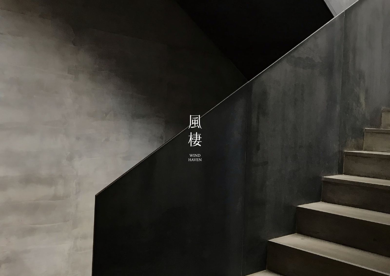
風棲空間制所 WIND HEAVEN INTERIOR DESIGN
「風棲」以「風停之處,心安之所」為核心理念,透過極簡留白語彙打造專屬的室內設計品牌識別,展現細膩而專業的品牌精神。設計以風的流線與層次象徵情緒與空間的平衡,傳遞品牌形象設計中穩定與溫潤並存的特質。整體風格兼具室內設計師品牌美學與現代極簡氣質,塑造柔韌且具生命力的專業形象。
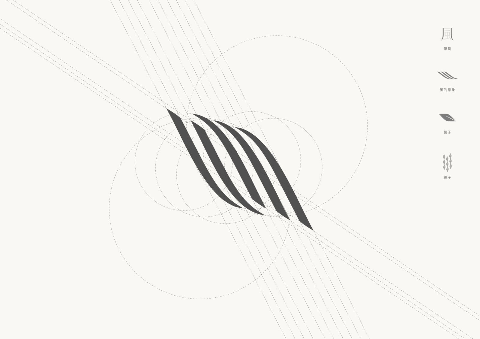
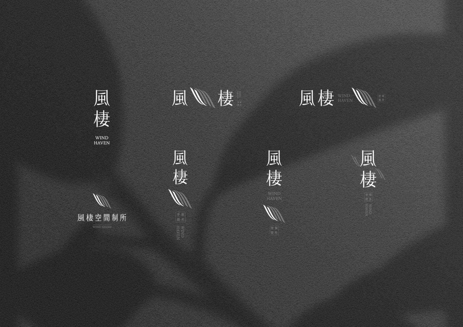
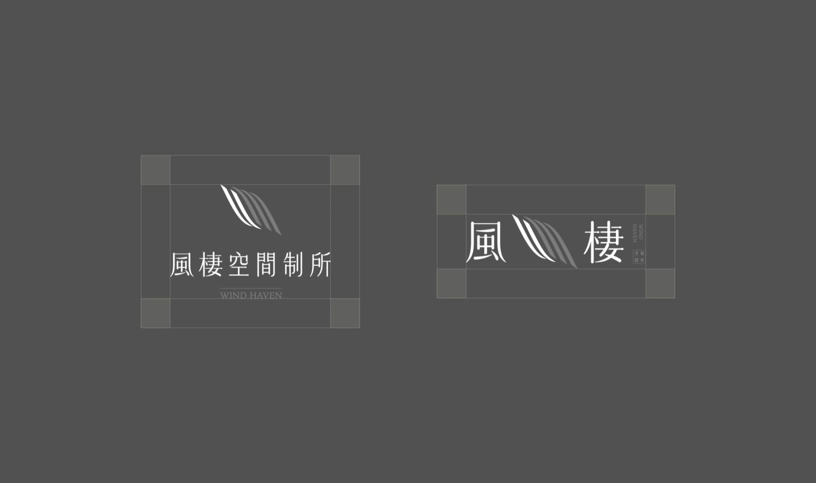
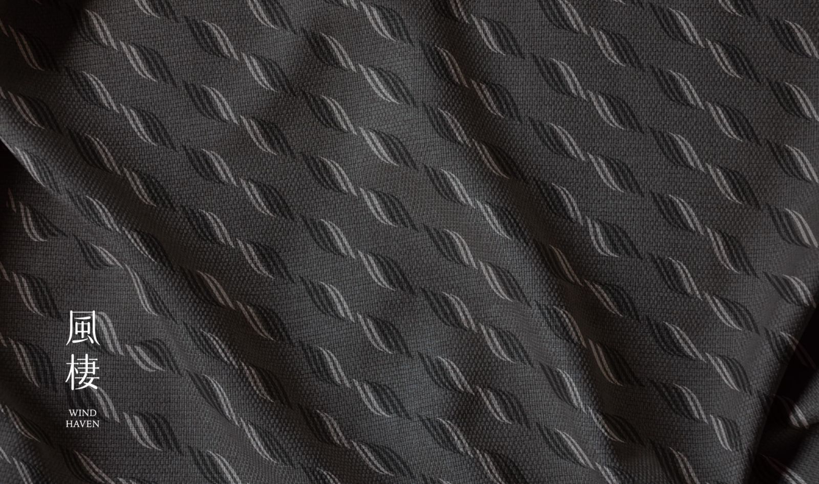
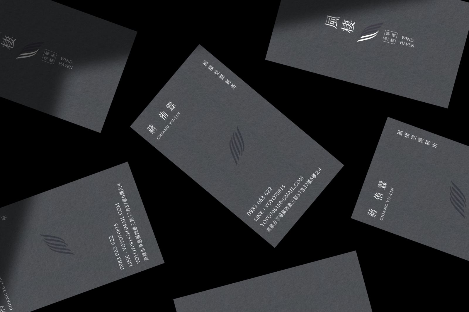
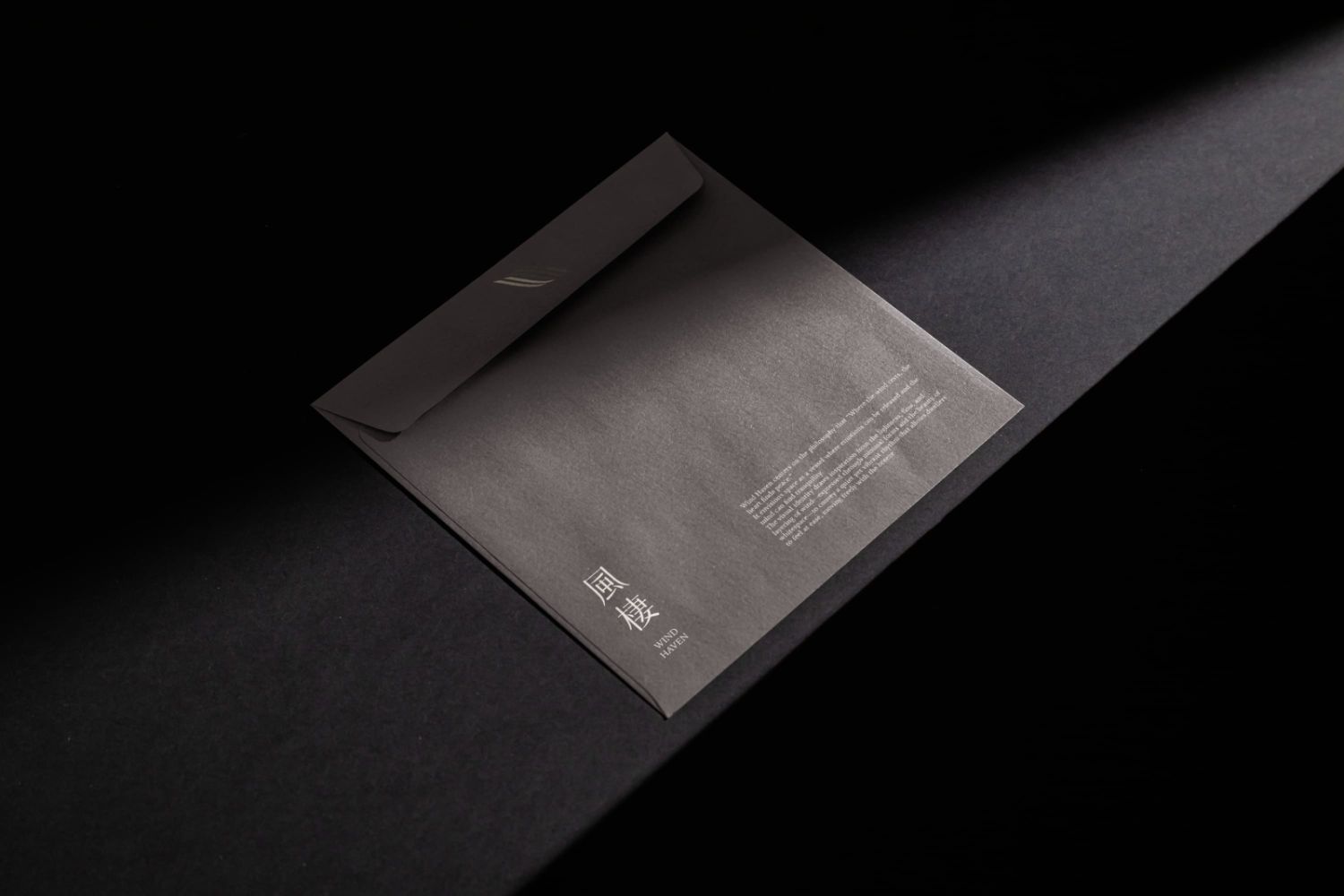
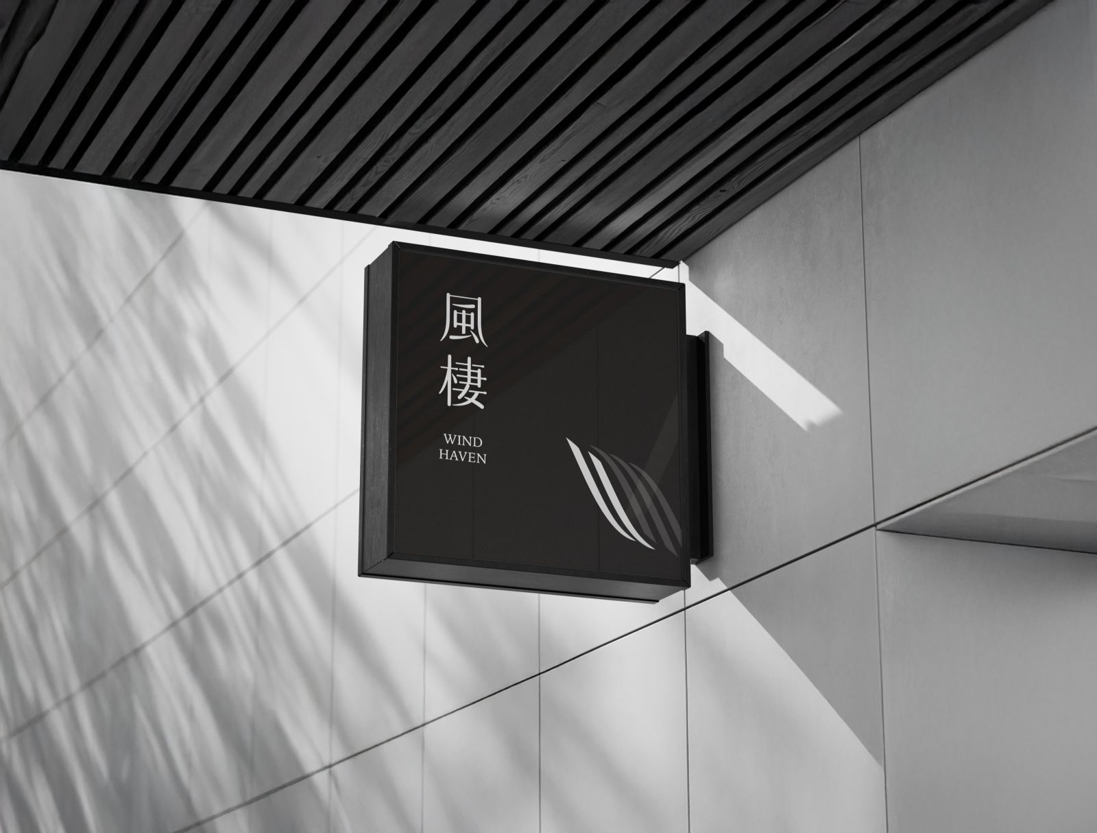
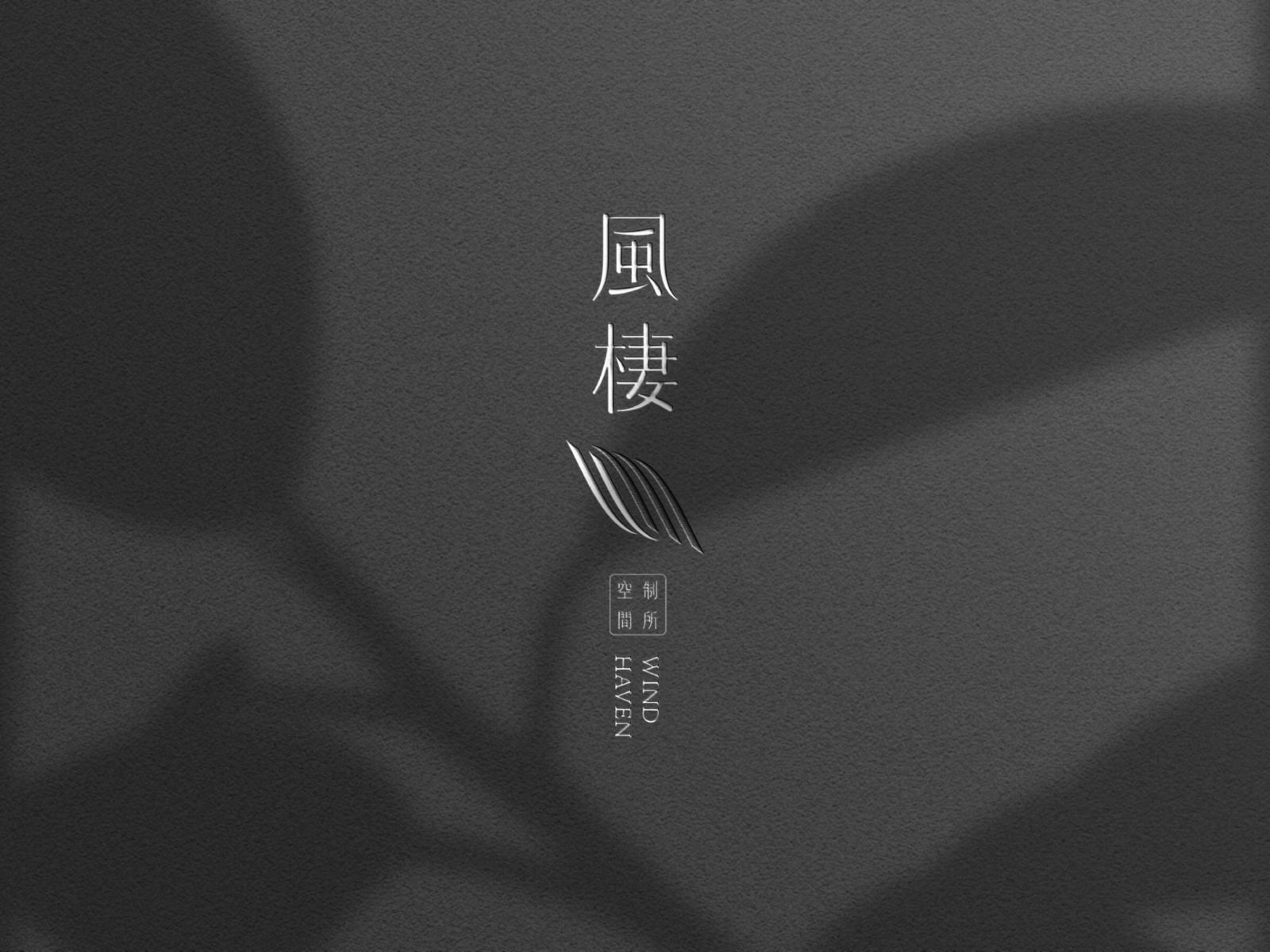
圖標設計取「風」的筆劃結構為視覺主軸,以延伸線條象徵風的流動與自由。整體造型在動靜之間取得平衡,如抽象的風之畫面或輕盈的葉片,展現品牌識別的靜謐與靈動。筆劃串連形成如繩索般的律動線條,寓意品牌在空間設計中扮演「連結」與「牽繫」的角色。整體以極簡灰階層次為基調,體現穩定與溫潤的專業形象,呼應品牌美學與自然流動的高質感設計風格。
Wind Heaven embraces the philosophy of “Where the wind rests, the heart finds peace.”
The brand identity captures the essence of serenity and connection through a minimalist approach, creating a refined interior design brand identity that reflects both professionalism and warmth. Inspired by the flowing structure of wind, the design balances emotional depth and spatial harmony, expressing the calm yet resilient character of a professional brand image rooted in modern design aesthetics.
The logo design draws from the calligraphic strokes of the Chinese character “wind,” transforming its linear rhythm into a symbol of fluidity and freedom. The composition achieves visual balance between motion and stillness, evoking an abstract image of wind and nature’s quiet grace. The connected strokes resemble woven threads — representing the brand’s role in space design, bridging people, designers, and living environments. The grayscale palette reinforces a sense of stability and softness, embodying high-quality minimalist design and brand aesthetics that flow naturally through every detail.